Pages
▼
Monday, February 25, 2013
Texture Updates
These are rough, but hopefully it's going in a better direction. :) Which seat colors do you like the best? Some of the seat pictures were taken before I shaded the bars on the seats, so ignore the white. :) -Sid
Saturday, February 23, 2013
Thursday, February 21, 2013
Tuesday, February 19, 2013
Concept of the ink...thing again
So this time I made them look more watery ( hopefully they do). And I added some warm green to the light. Next time I am going to use milk as reference and compare.
Monday, February 18, 2013
Saturday, February 16, 2013
Maggie Emotions
Walk Cycle
And yes...there's a lot left to be said about this animation... OTL
Friday, February 15, 2013
Wednesday, February 13, 2013
Tuesday, February 12, 2013
Drop Animation for Jarom
Jarom! You are definitely on the right track, here are some notes and an animation to help you out.
If you don't have Joseph Gilland's book yet, buy it. I highly recommend it.
The animation is best viewed in Firefox or Chrome.
The number in the top left is the drawing number, not the frame number. Everything is on ones except for drawings 1,8,9, and 11.
I know that you said that you referenced a water into water splash to animate, that's fine, just make sure that your drop doesn't gain volume when it hits the ground, other wise it will feel like it hit water. Keep the principles of design in mind while animating : asymmetry, big med small, appealing shape, arcs, exaggeration, etc.
That's it! If you have any questions, let me know.
-Paige
Monday, February 11, 2013
Some arm tests
Christina, I know you didn't want these animated, but I felt like that was the best way for me to figure out the movement, since these are effects, they would look better inbetweened, but I would like your feedback. So here are a few variations, I almost feel like the four limbs is overkill, but I will have to experiement more.
Thanks!
Paige
Sunday, February 10, 2013
Color Theory
I'm noticing that with the Lucy designs the colors feel like they are being chosen too haphazardly with very little regard to their relation to each other. So to everyone who's been doing concepts for clean-up, I think this PDF should be mandatory for reading. It's a character art guide for Dota 2, but the concepts within are applicable to any kind of design.
Thanks guys, keep it up!
Saturday, February 9, 2013
More Clean-Ups
Thanks!
Friday, February 8, 2013
Ink Monster-Thing
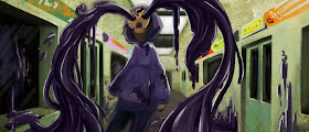
I decided to play around with the Monster-Ink thing that comes from Maggie's eyes. Since the very beginning, I've always thought the hands to be more claw-like, to emphasize how out-of-control the hysteria is for the character. I dunno, its just my impression.
Anway, feedback is always welcome!
Rough Animation - Maggie
Just a quick rough animation of Maggie. Still learning, so any suggestions or critiques would be great!
Thursday, February 7, 2013
Starting to learn FX
What?! Jarom is actually doing something? :) this is mostly for Paige and Sydney. I originally wasn't going to post this because it's a terrible first attempt. BUT I need to be posting more and holding myself accountable, so it starts....NOW. give some "feeds" on my back, if you know what I mean.
Guys, I really hate to do this...
...but I changed Lucy's proportions again. Basically I just stretched her out vertically so that she looks taller.
Wednesday, February 6, 2013
Maggie's Color Schemes Ideas
I've decided to play around with some possible color schemes for Maggie. I thought that a natural/dull tone would be the best color for her character, and I've played around with a few different shades for her hair and skin. I'll take any suggestions and recommendations. I wanted to do work on Lucy's colors but I haven't had the time to do so yet; I hope to work on it during this weekend.
Tuesday, February 5, 2013
Words wrting on the walls
So, I figured out how to write text in after effects. Unfortunately there isn't a quick way to make a mask and make the writing look convincing. You have to individually trace each letter, but I don't think that will be a big deal because by masking the text you have greater control over how it is written. If some of the text in the shot is very small, I am sure we could cheat with a simpler mask.
-Paige
Monday, February 4, 2013
Saturday, February 2, 2013
Words Flying into eye test
This isn't perfect, let me know if I am on the right (subway) track. Created with AfterEffects.
Lucy Character Design is UP
And here they are together:
I will probably streamline Lucy's design a bit more, but this is pretty much it. Now that I've got this out of the way, I'm gonna start working on ASSIGNING YOU GUYS SHOTS SO WATCH OUT FOR THAT. YEEEEEAAAAAAAAAAHHHHHHHHHHHH
Paint-over
Lin Lin Bao, Try something like this.
Just a quick 10 minute paint-over. The seats look a bit too shiny in mine, but there are a few things I'll point out. Remember your light source. It'll be valuable in everything you do. Local color is important. One thing to notice is the way that the wall should be constant in color all the way down and maybe gaining a bit of saturation while also gaining value. Notice how the shadow under the seat allows for a distinction between floor and wall. The windows should reflect the environment to an extent. Think about what's on the opposite wall just a little further down and drawing it over the window--it works fairly well. You ceiling (if it's behind the light source--depends on what type of lights there are) should still feel normal with a relatively strong light on them. I hope this sort of made sense ;-) You're a great artist, and you'll continue to rise above yourself and get better everyday. Cheers!
Just a quick 10 minute paint-over. The seats look a bit too shiny in mine, but there are a few things I'll point out. Remember your light source. It'll be valuable in everything you do. Local color is important. One thing to notice is the way that the wall should be constant in color all the way down and maybe gaining a bit of saturation while also gaining value. Notice how the shadow under the seat allows for a distinction between floor and wall. The windows should reflect the environment to an extent. Think about what's on the opposite wall just a little further down and drawing it over the window--it works fairly well. You ceiling (if it's behind the light source--depends on what type of lights there are) should still feel normal with a relatively strong light on them. I hope this sort of made sense ;-) You're a great artist, and you'll continue to rise above yourself and get better everyday. Cheers!


